| Section 3
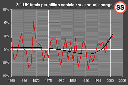
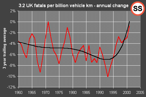
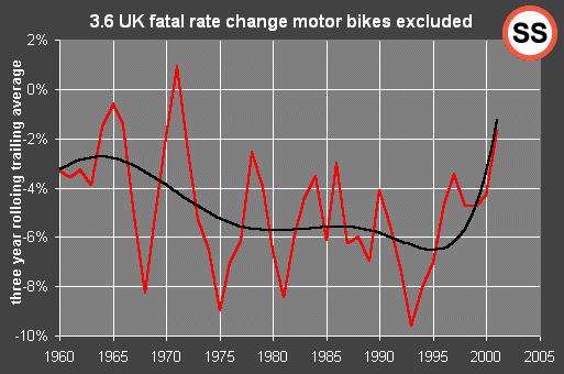
Here we look for trends in the changes
that we're seeing. The black lines are approximate visual guides to what
we believe the true underlying trends to be. The red lines are official
data. In some cases we've averaged the official data over a rolling period
of 3 or 5 years which has the effect of providing some "noise reduction".
The averaging process delays the response of the curve to changes, so for
example in graph 3.3 the recent low point shows as 1995. In reality the
recent low was in 1991, as shown in graph 3.1. Graph 3.1 is plotted from
exactly the same data.
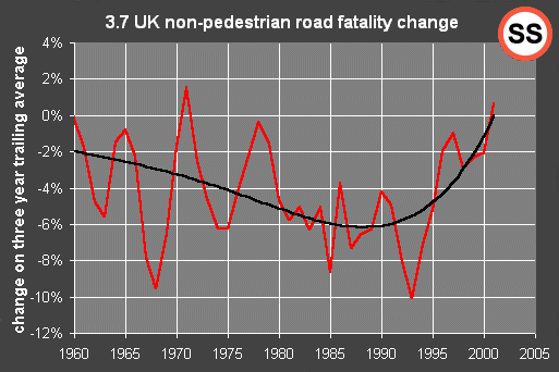
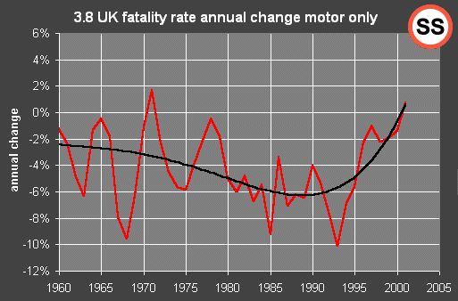
All the indicators appear to rising in
the last decade.
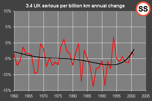
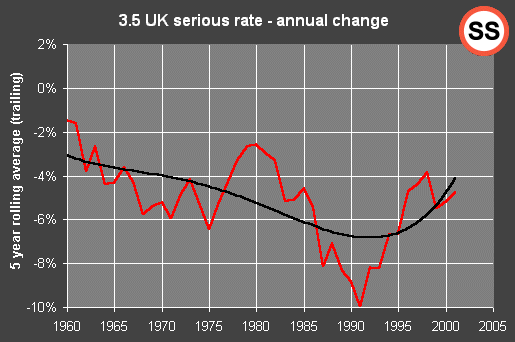
In some cases the trend has not yet reached
0%, which means for example, that serious accidents are still falling (graphs
3.4 and 3.5). But serious injuries appear to be falling more slowly than
previously and the change is progressing. We expect serious accidents to
reach 0% in about 2004 if nothing is done to improve the situation.
The trend in fatal accidents is the most
worrying of all. Graph 3.1 is clearly rising from an excellent 12% improvement
in 1991 to 0% in 2001. We certainly expect it to rise again with the 2002
figures. |